Resident personal portal: redesigning how residents interact with their city

The city offered plenty of useful digital services. Residents just couldn’t find them, so they kept calling and coming in.

01

The problem

Payments, permits, requests and status tracking each lived in a separate system. Residents had to know which one to use, got confused, and fell back on phone calls and service centers. For the city, that meant low digital adoption, duplicated work across departments and high operational costs.

Fixing individual flows wouldn’t have been enough. Even residents who completed a task didn’t come back.

The real challenge was redesigning the platform as a single, reliable product, one residents could recognize, trust, and return to.
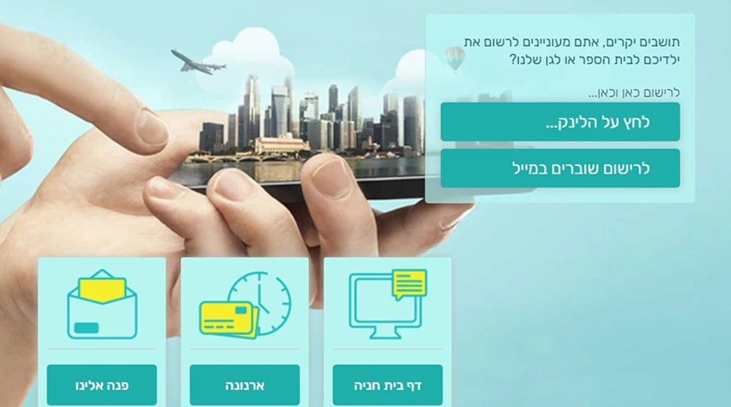
The old home page: a stock photo and three service tiles
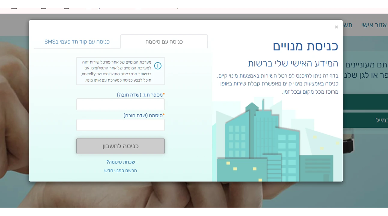
The old log-in pop-up
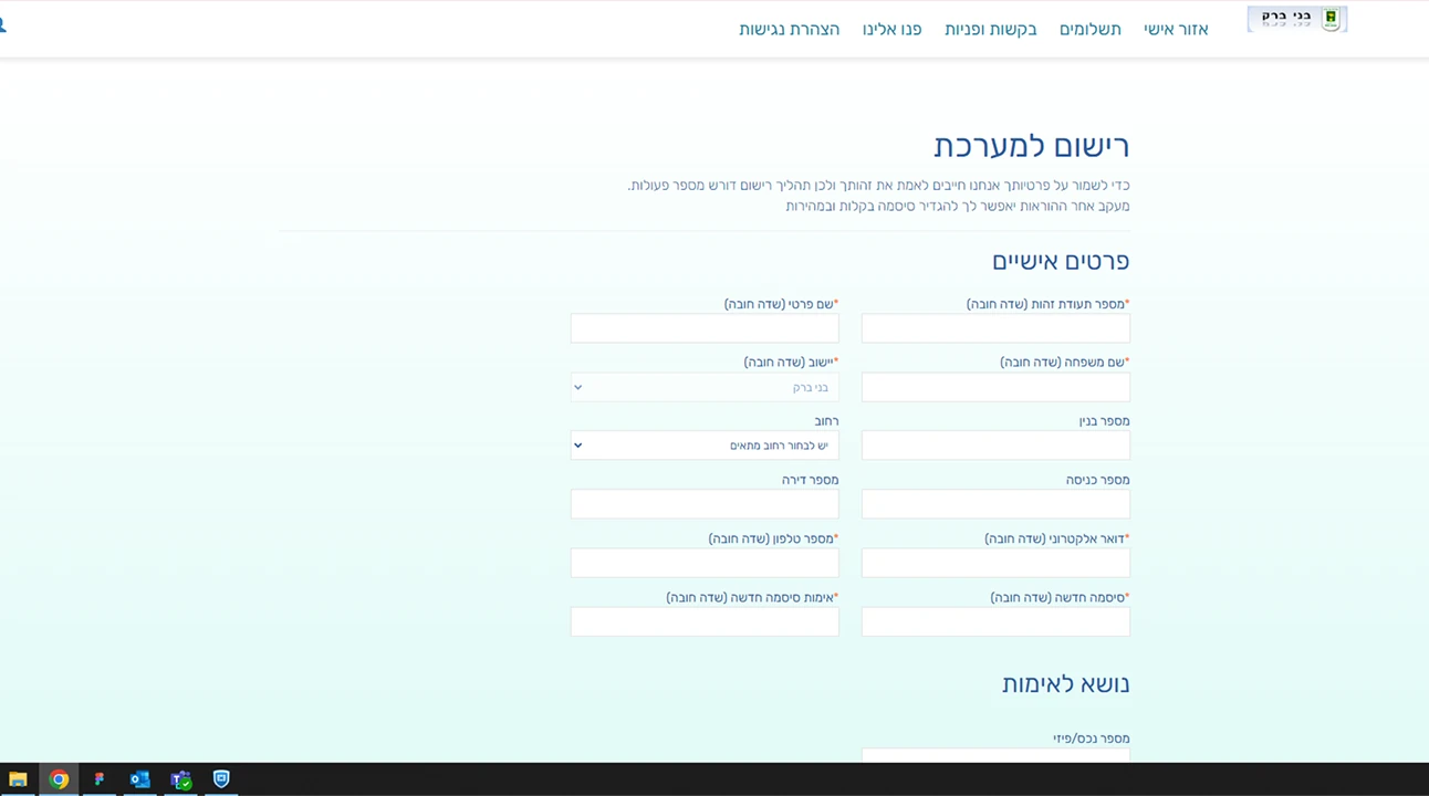
The old sign-up form
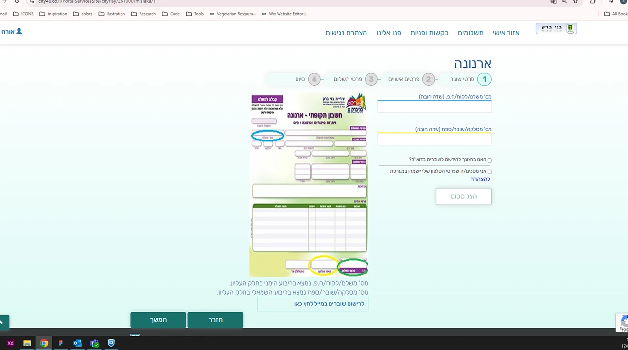
The old city tax payment page
1 / 4

The old system: home page, log-in, sign-up and the city tax payment page.

02

Principles

Four principles guided every decision. Each design below names the one it applies.

P1

One city, one entry point

Residents shouldn’t need to know the city’s internal structure to use its services.

P2

Human language

Familiar patterns, with municipal terminology replaced by words residents use.

P3

Transparency builds trust

Clear status, history and next steps are what bring people back.

P4

Designed to scale

New services and new municipalities without redesigning the experience.

03

The design

A
WHAT WE LEARNED

Residents think in goals, not departments

WHAT I DESIGNED

I reorganized navigation and content around what residents want to do: pay, apply, report, follow up. The home page leads with what needs attention, then shows what’s happening in the city.

P1P2

The navigation grouped by intent, and the home page that leads with what needs attention.

B
WHAT WE LEARNED

A generic interface felt distant from the local authority

WHAT I DESIGNED

I designed a flexible visual framework: each municipality brings its own logo, colors, fonts and icon style, while the structure and interactions stay the same.

P4
1 / 3

Same system, three municipalities: Holon, Kiryat Ata and Harish.

C
WHAT WE LEARNED

Most visits were one-off payments, with no reason to return

WHAT I DESIGNED

I added reasons to come back, like city events and updates, and deep views for each area of life: assets, water and personal details, each with a clear summary first.

P3
1 / 3

The assets, water and personal details pages.

D
WHAT WE LEARNED

Every charge had its own system, its own payment and its own receipt.

WHAT I DESIGNED

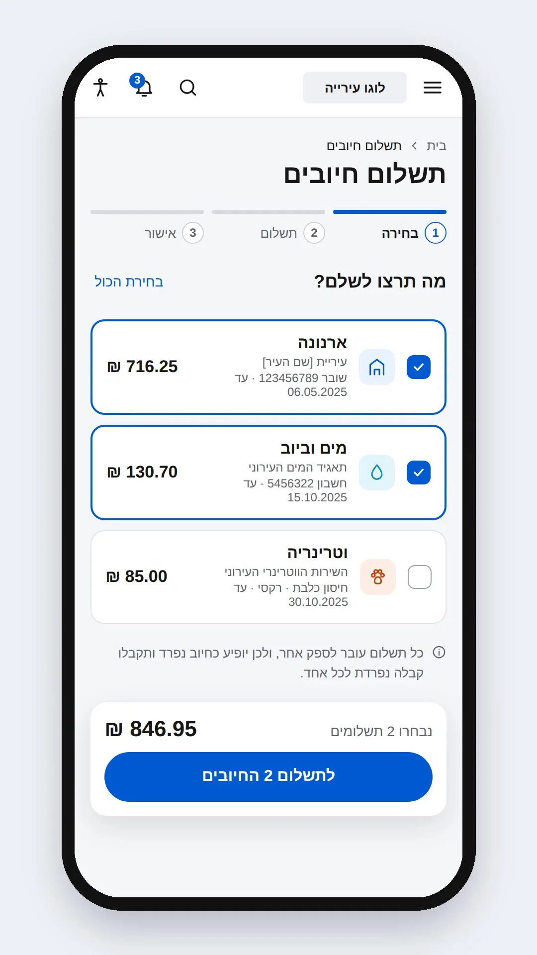
Residents see one balance that’s clearly made of separate payments, choose which ones to pay now, pay once, and get a receipt from each supplier, with what’s left still visible.

P3
Video: paying 2 of 3 open charges. The home page shows one balance made of three payments; the resident unticks the vet charge, pays city tax and water by card, and gets a receipt for each supplier.

The multiple-payments flow: city tax and water paid together, the vet charge left for later.

04

Outcome

BEFOREAFTER
FOR RESIDENTS

Separate systems for every service, and calls to service centers.

One place to pay city bills, buy tickets to city events, see payment history, and submit and track requests.

FOR THE CITY

Low adoption, duplicated work across departments.

Several municipalities asked to join as pilot cities and keep developing the system together.

THE RELATIONSHIP

Visits only when a payment was due.

More than a payment page: a personal space where residents keep up with what’s happening around them.

WHAT I LEARNED

Create the research you don’t have. I had no time, opportunity or management support to run user research, so I worked with what I had: managers from every area the system touches, from property tax and water to education and customer service. If I couldn’t reach residents directly, I could reach the people who know them best, and who are residents themselves, so they gave input from both sides. That process taught me a lot and produced the insights the design is built on.

Next project: GIS Enterprise System
Contact

Let’s create something amazing together

Available for new opportunities

© 2026 Shai CarmelBack to top ↑

Resident personal portal: redesigning how residents interact with their city

The city offered plenty of useful digital services. Residents just couldn’t find them, so they kept calling and coming in.

01

The problem

Payments, permits, requests and status tracking each lived in a separate system. Residents had to know which one to use, got confused, and fell back on phone calls and service centers. For the city, that meant low digital adoption, duplicated work across departments and high operational costs.

Fixing individual flows wouldn’t have been enough. Even residents who completed a task didn’t come back.

The real challenge was redesigning the platform as a single, reliable product, one residents could recognize, trust, and return to.
The old home page: a stock photo and three service tiles
The old log-in pop-up
The old sign-up form
The old city tax payment page
1 / 4

The old system: home page, log-in, sign-up and the city tax payment page.

02

Principles

Four principles guided every decision. Each design below names the one it applies.

P1

One city, one entry point

Residents shouldn’t need to know the city’s internal structure to use its services.

P2

Human language

Familiar patterns, with municipal terminology replaced by words residents use.

P3

Transparency builds trust

Clear status, history and next steps are what bring people back.

P4

Designed to scale

New services and new municipalities without redesigning the experience.

03

The design

A
WHAT WE LEARNED

Residents think in goals, not departments

WHAT I DESIGNED

I reorganized navigation and content around what residents want to do: pay, apply, report, follow up. The home page leads with what needs attention, then shows what’s happening in the city.

P1P2

The navigation, grouped by what residents want to do.

B
WHAT WE LEARNED

A generic interface felt distant from the local authority

WHAT I DESIGNED

I designed a flexible visual framework: each municipality brings its own logo, colors, fonts and icon style, while the structure and interactions stay the same.

P4
1 / 3

Same system, three municipalities: Holon, Kiryat Ata and Harish.

C
WHAT WE LEARNED

Most visits were one-off payments, with no reason to return

WHAT I DESIGNED

I added reasons to come back, like city events and updates, and deep views for each area of life: assets, water and personal details, each with a clear summary first.

P3
1 / 3

The assets, water and personal details pages.

D
WHAT WE LEARNED

Every charge had its own system, its own payment and its own receipt.

WHAT I DESIGNED

Residents see one balance that’s clearly made of separate payments, choose which ones to pay now, pay once, and get a receipt from each supplier, with what’s left still visible.

P3
Video: paying 2 of 3 open charges. The home page shows one balance made of three payments; the resident unticks the vet charge, pays city tax and water by card, and gets a receipt for each supplier.

The multiple-payments flow: city tax and water paid together, the vet charge left for later.

04

Outcome

FOR RESIDENTS

BEFORESeparate systems for every service, and calls to service centers.

AFTER →One place to pay city bills, buy tickets to city events, see payment history, and submit and track requests.

FOR THE CITY

BEFORELow adoption, duplicated work across departments.

AFTER →Several municipalities asked to join as pilot cities and keep developing the system together.

THE RELATIONSHIP

BEFOREVisits only when a payment was due.

AFTER →More than a payment page: a personal space where residents keep up with what’s happening around them.

WHAT I LEARNED

Create the research you don’t have. I had no time, opportunity or management support to run user research, so I worked with what I had: managers from every area the system touches, from property tax and water to education and customer service. If I couldn’t reach residents directly, I could reach the people who know them best, and who are residents themselves, so they gave input from both sides. That process taught me a lot and produced the insights the design is built on.

Next project: GIS Enterprise System
Contact

Let’s create something amazing together

Available for new opportunities

ResumeView resumeLinkedInLinkedIn profileEmailshaic99@gmail.com