
GIS Enterprise System: making a data-heavy mapping system feel light and human
As the platform grew, its interface didn’t. I led the design of a clearer, scalable foundation for multiple user types and municipalities.
The problem
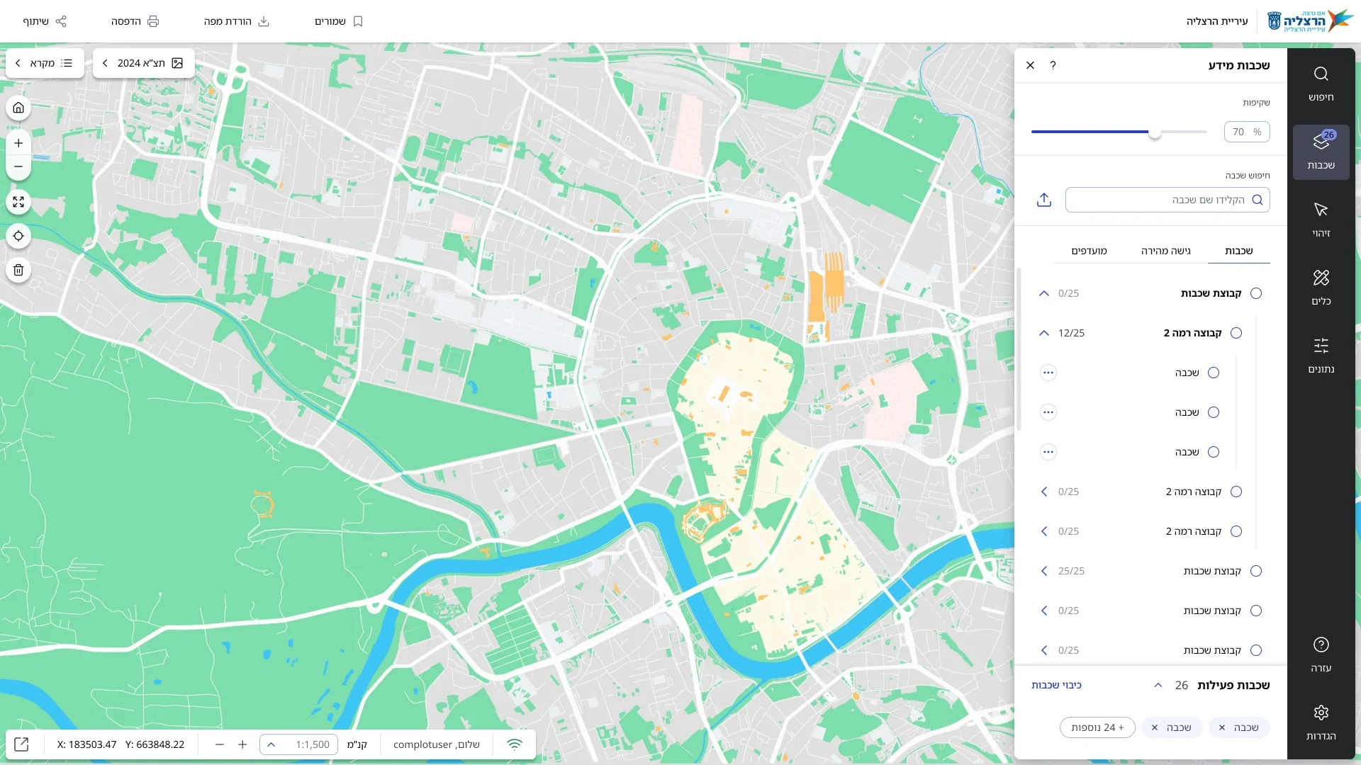
A Geographic Information System is a data-driven map: users layer different types of information, like infrastructure, environmental data or real-time inputs, to manage assets and make location-based decisions.
As capabilities were added, controls piled up without a clear hierarchy, and the tools people relied on most were buried alongside everything else.
What we heard
“I tried to find shelters near my home and gave up very quickly.”
“The system is painfully slow.”
“As a resident, I expect things to work efficiently, without unnecessary delays.”
“I’m trying to keep up, but it’s so confusing. I wish things were simpler.”
“I had to create a presentation to explain and guide other employees on how to use the system.”
“Something about a top navigation bar feels cleaner and easier to understand.”
“Our goal is to provide customers with a system that’s so intuitive, it simply works for them.”
“Field workers rely on me, and I have to make sure they get fast, efficient solutions in real time.”
“Integration with other systems is extremely important to me. It makes the work far more efficient.”
Real comments from interviews with residents and professional users.
The design
Users felt lost when the structure was unclear
Navigation and orientation weren’t clear, and controls lacked consistent logic and hierarchy.
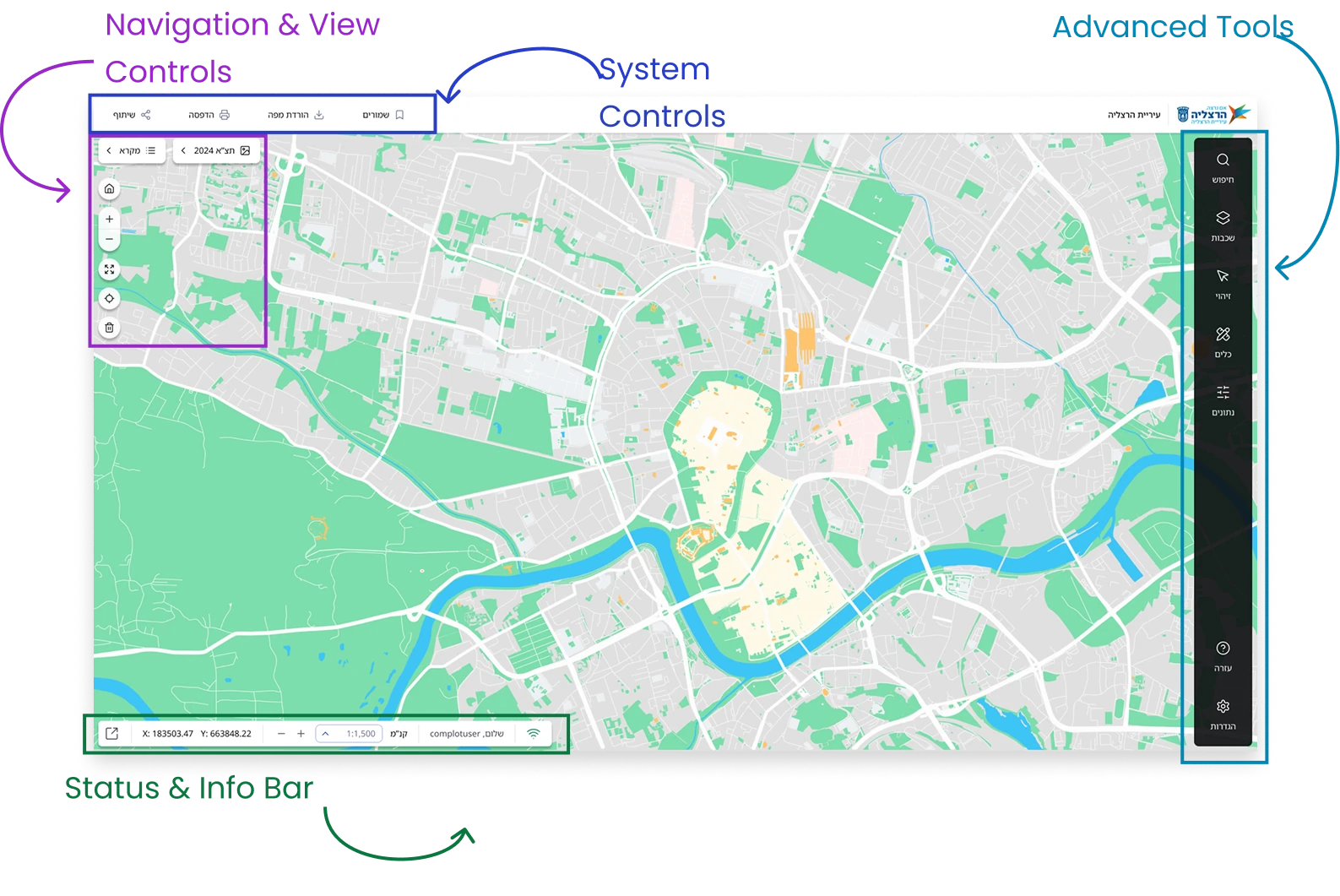
I reorganized the tools into four clear zones: navigation and view controls, system controls, advanced tools, and a status and info bar.
Layers drive every decision
Users constantly toggle layers to understand context, compare data and make spatial decisions.
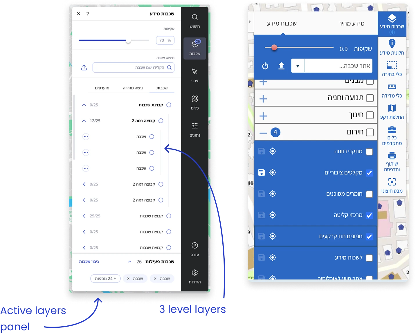
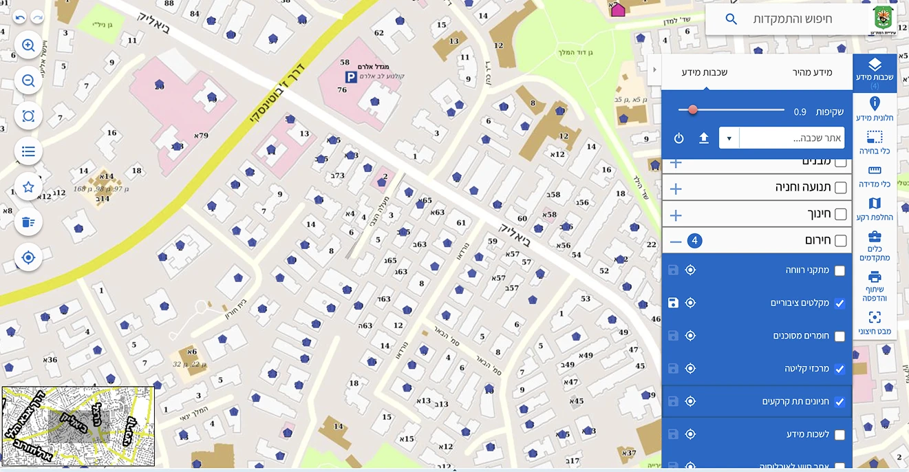
A layers panel with three levels of grouping, layer search, a transparency control and a summary of active layers, clear for professionals and occasional users alike.
Consistency matters, and so does continuity
Tools that behaved differently made the system harder to learn, while some familiar behaviors worked well.
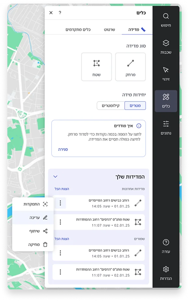
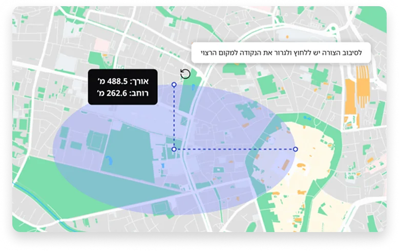
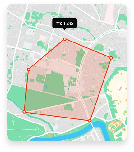
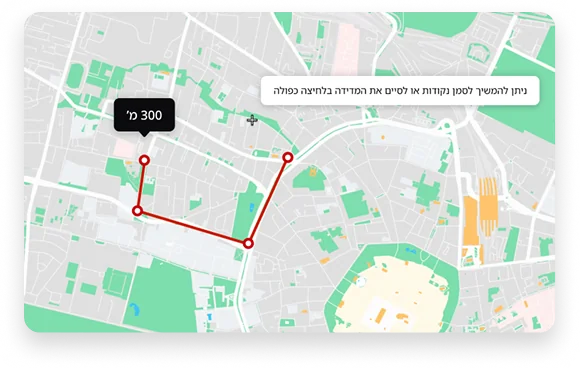
Measurement and drawing were redesigned to follow the new interaction model. The data table, which opens from the bottom of the map, was deliberately kept, so experienced users didn’t lose a pattern they relied on.
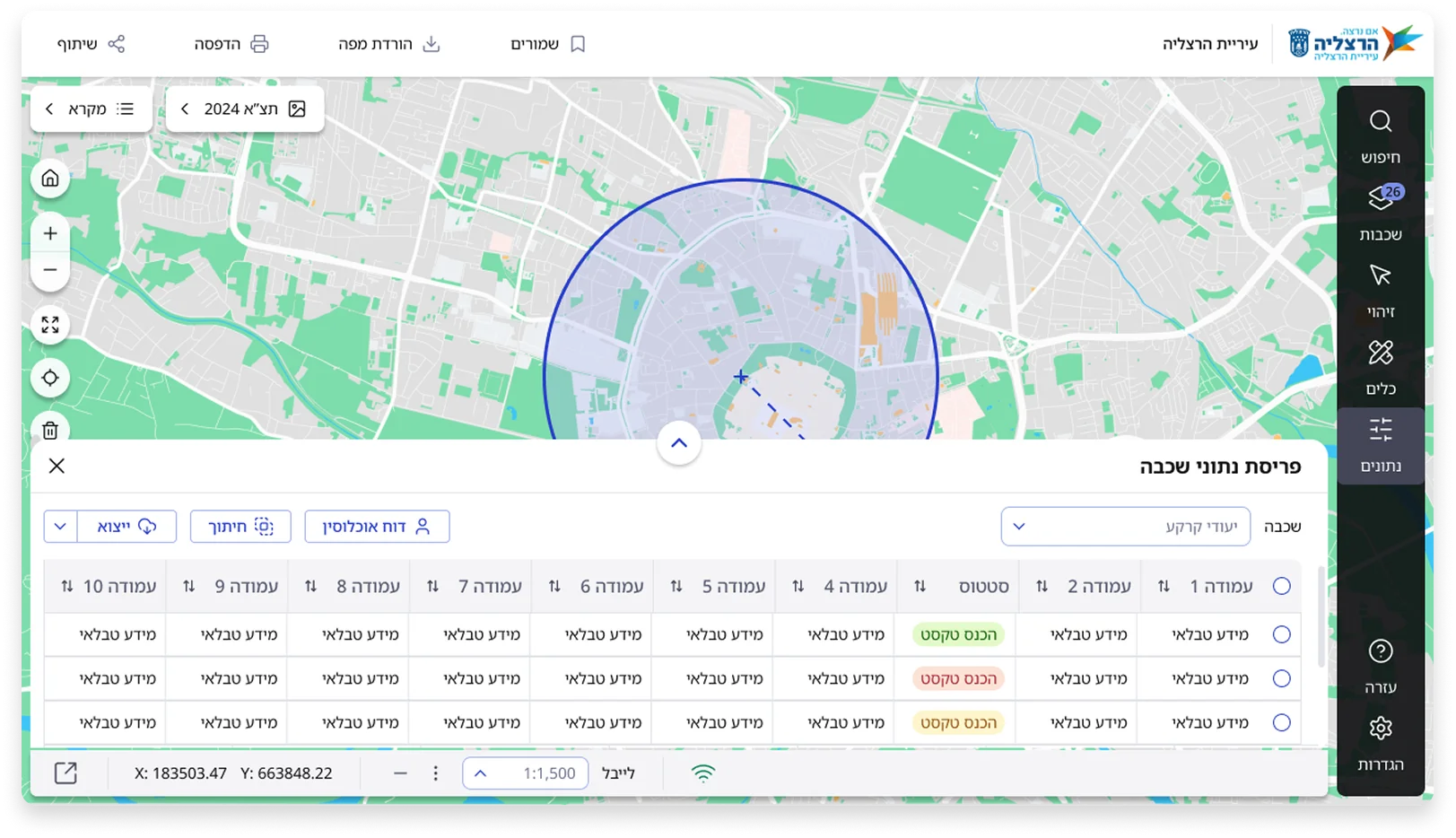
Before / after
The same task on both versions: the main screen with the layers panel open. Drag to compare.
Outcome
Some had to make presentations to teach colleagues the system.
A clearer hierarchy and built-in tooltips let people learn the system inside the product, instead of from a colleague’s presentation.
Gave up quickly when looking for information.
Tools are easier to recognize and information is quicker to find, so common tasks take fewer steps.
Every new capability made the interface harder to use.
Built to grow: tools are grouped so new capabilities have a clear place, without crowding the interface.
Trust my instincts on time. I felt the tools needed more definition, but under pressure for quick solutions I kept cutting that phase. The result was many rounds of revisions with the clients. Next time, I’ll make the case for the time up front, because the shortcut didn’t actually save any.
Research pays off every time. Interviews with both residents and professionals shaped the biggest decisions, like the layers panel.
Let’s create something amazing together
Available for new opportunities


